
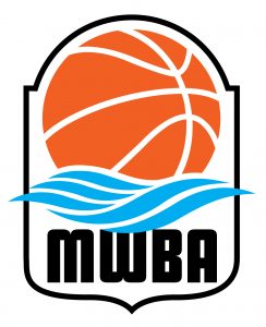
First version of MWBA logo
Creating a logo is not an easy endeavour.
Multiple phases are parts of finding the right look, the right colours and scheme and finding one that appeals to many for a number of reasons.
Just like the Maritime Women’s Basketball Association.
One of the first orders of business – almost immediately following the naming of the league that is preparing for a spring of 2022 start – was to create a logo to anchor its website and marketing channels.
New Brunswick’s Michael Carter, a veteran graphic artist, offered the first rendition of the league logo just to get the first stages of contact information started.
Carter’s logo was colourful and easy to follow, using the blue waves of water for a Maritime flavour, the bright orange basketball and MWBA in bold black letters.
It is visually appealing and simple to understand, the logo used numerous times in the early stages of gathering individuals who were interested in owning potential MWBA franchises.
When Fredericton-based TRL Solutions came on board as a key MWBA corporate sponsor, one of its artists asked to create another logo, building on the initial concept. TRL uses Fredericton’s Steve Boulter and Marysville’s Jana Reid as in-house designers.
Many involved loved the simplicity and succinct initial logo, and immediately jumped on board the TRL Solutions design as the logo moving forward.
The logo carried on the initial concept with the wave crashing over a basketball, keeping the attractive orange colour but building it with rising water images inside the MWBA, adding the full name of the league to provide immediate understanding of what it is and, for good measure, adding the Canadian maple leaf.
Outlined by a cool grey border, the logo is colourful and attractive.
Its colours will also allow for apparel choices from blue, black, white and orange.
MWBA apparel and other items will be available later in 2021, but you will see franchise representatives and league executive and board members sporting the colours and logos early in the new year.
Carter, who is based in Nackawic, designed the logos for the Fredericton Freeze and Halifax.
As the MWBA continues to move toward its opening, we will profile all the teams, their selected logos and how the nicknames came about.